CASE STUDY
Bridge - Helping Immigrants Connect
TIME
2 weeks
TEAM
5 members
MY ROLE
UX Designer
Visual Designer
Prototype Lead
User Researcher
Prototyping & Testing
TOOLS
Figma
Miro
Trello
Illustrator
Challenge:
Immigrants when move to a new place have a hard time accessing informational resources and opportunities to connect with others in order to start their new lives comfortably.
Goal:
Bridge was created to help immigrants acclimate and make their transition smoother. To help alleviate the pain of transitioning to a new country by:
1. Providing a way for immigrants to connect to others similar to them in their community
2. Giving them access to resources
Imagine coming to a land with no friends or family, and zero clue about the required resources in order to start a new life


Research and Problem Definition
Speaking with User
Interviews
In order to understand our persona better, we interviewed 7 immigrants between the age ranges of 20 to 45. The users were from Central Europe, South Asia, South East Asia and West Africa who have been living in U.S. from 6 months to more than 20 years.
What did we want to know?
-
To discover how a user navigates difficulties when moving to a new country
-
To figure out pain points individuals have when settling in the new locality
-
To find out what would help people to fit into a new community

“If someone is willing to take me under their wing, I would
appreciate it!"

“Language was a difficulty for me, since English was not my first language.”
Affinity Diagram
After conducting the user interviews, the collected data was then divided into 7 categories. The main categories consists of “Culture”, “Community” and “Challenges”.
Challenges
Some people judged her accent
Hard to pick up on cultural norms
Hard to understand laws
Getting a job is hard
Can be difficult to manage ID's, SS#
Taxes are different in USA
Elderly find it more difficult to settle in and connect
Slang was difficult to learn
Language was a difficulty
Didn't feel as connected to friends here
Felt completely lost
Couldn't practice religion too freely
Community
Only had a brother living in USA
Want to make more friends
Starting was joining a church
Built community through college
Didn't know anyone when first moved
Having a community helps a lot
Feels less lonely with friends here
Culture
Doesn't want to forget their roots
I have many perspectives from living in two places
Keep in touch with her Chinese culture
Values from origin Country
What were the discoveries?
Support
Create an app that will help immigrants settle in a new location.
Connect
Connect people from different or similar cultures.
Build
Assist in generating opportunities for community building.
Inform
Understand the differences between each culture and provide resources.
Bridge Survey
12 questions were included in the survey and sent out to gather quantitative data to support our previously done qualitative research. This survey was filled out by 89 respondents.
Key Insight:

User Persona

Persona
There Must Be Something Out There!
I then conducted a competitor analysis by searching the internet as well as the app store to find platforms which are focused on helping in immigrants. This research step helped in understanding the strengths and weaknesses of these direct and indirect competitors in terms of offering and features.
After identifying 5 competitors overall, we focused on USA Hello, our indirect competitor, and Imcovery, a direct competitor.
The image shows the strengths and weaknesses of the two competitors.

Key Insight:
The existing competitors are dedicated in helping immigrants by focusing on either providing them resources or helping them build a community. However, none of them offers something which is inclusive of both at the same time.
This research helped in designing Bridge, an app that helps immigrants in their early stage of settling in by both educating them as well as connecting them.
Click image to enlarge.
Competitor Analysis
Ideate & Brainstorming
Let's Brainstorm!
After analyzing the affinity diagram, I created the Feature Prioritization Matrix. The entire team dot voted on the high priority ideas from the list of "I like", "I wish" and "What if" categories. The larger area of focus revolved around high impact and low complexity section which include features such as:
-
Finding nearby events
-
Connecting and building a community
-
Learning the language
Click image to enlarge.


User Journey Map
The data collected from feature prioritization matrix and the interviews, I created a user journey map which captured the user’s journey and emotional results with each touchpoint they perform within the app.

Journey Map
Keeping in mind the discovered pain points and desires, my team and I finalized the tasks most beneficial and crucial for the users. I designed the user flows emphasizing on finding events and resources, building a community and signing up to this app.
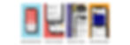
Click on the icons below to view the full user flows.
Userflow
Wireframing, Prototyping
and Testing

Developing Layouts and Formulating
The process of wire-framing began with paper sketches which transformed into Lo-Fi wireframes shown below. My team and I completed usability tests on them to further develop the design.
Click to enlarge the image below.

Design, Test, Iterate Loop
Based on the insight collected so far from user testing, many issues uncovered themselves and the design required further iterations. The images below show the design changes made to Lo-Fi prototype which I then translated to the Hi-Fi prototype. My team and I ran user tests before re-iterating the final design.
Scroll images to view the iterations.
Style Direction
As early as the research stage of this project, I began contemplating the brand identity for Bridge. During user interviews, I interacted with people from different backgrounds and looking at their eyes sparkle when they spoke of their culture, I immediately wanted to incorporate colors which the users could relate to. The branding decision revolved largely around creating a balance of cool and warm colors along with making sure a sense of balance was achieved by adding both bright and subtle colors.
Click image to enlarge.

Style Tile
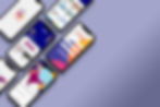
Hi Fidelity Wireframes


KPIs
-
User retention rate
-
Number of connections made per user
-
Amount of RSVP clicks per event listed on the app
-
Daily active users
-
Average number of screens viewed per visit
Conclusion and Future Steps
There are still many parts of the design which needs to be explored. Overall, the takeaways from the user testing was positive. Users appreciated the simplicity and accessibility which the design offers as well as the overall UI of the app.
For the future steps, some of the areas of focus include:
-
Building out resources page
-
Develop mentorship program
-
Upgrade filter systems
-
Add language translations